Cook Children's Health Care System | Brand Strategy & Education
Brand Central
"The logo is just the tip of the iceberg. Brand is everything the organization does, says, feels, and promises."
When Cook Children's Health Care System undertook a full rebrand, the first challenge wasn't choosing colors or a typeface. It was changing the way thousands of people across the system understood what brand actually means.
Most people think of brand as the visible stuff — the logo on the badge, the colors on the website, the ad in the waiting room. We called that little b. The real work was teaching the system to see the bigger picture.
Big B Brand: Organizational culture and values. Reputation in the community. Relationships with families and partners. Staff and patient family experience. Intellectual property and strategy. Trust built over decades.
Little b brand: Logo and wordmark. Color palette and typography. Photography and illustration style. Advertising and campaigns. Templates and graphics. Brand guidelines.
Little b serves Big B — the visuals and guidelines only matter because they express something much larger. Brand Central was built to teach both, and connect them.
With that framing in place, the team reinvented its own role. Instead of being the brand police — chasing down rogue flyers and wrong hex codes — they became the brand concierge. Brand Central was the product of that shift: a dedicated website that made brand knowledge accessible, empowering, and something people actually wanted to engage with.

The site was organized around five navigation pillars — verbal identity, visual identity, brand in use, downloads, and resources — giving staff and vendors a clear, self-serve path to whatever they needed, updated continuously with new resources.
The building blocks section gave everyone a shared vocabulary — logo, colors, typography, dot motif, photography, and icons — each with its own deep-dive guidelines built to help people understand the why behind every decision, not just the rules.
The depth went far beyond what most brand guides attempt. Illustration style, data visualization principles, diverse skin and hair tone palettes, things to avoid — and how the logo should appear on a lab coat, down to exact placement, font, and character limits for embroidery. Voice received the same rigor as visuals: AP Style plus a full Cook Children's-specific style guide, and clear "things to avoid" framed as coaching, not policing.
Brand Central extended into motion, too. Video guidelines covered logo animations, title cards, type supers, lower thirds, and transitions — all grounded in the same brand philosophy: connected, collaborative, and expressed with a dot-to-dot visual warmth rather than something generic or overly playful.
Some brand elements were about culture first, visuals second. Peaks the Dragon® — Cook Children's beloved mascot — had his own dedicated section on Brand Central, explaining not just how to use him, but why he exists: to embody the organization's third commitment, finding moments for magic for patients and families. Peaks evokes belonging, delight, and hope — a mascot rooted in a cultural commitment, not just a marketing device.
The downloads section kept growing. A custom pictogram library eliminated the need for off-brand clip art system-wide. On-brand Zoom backgrounds gave remote employees a small but meaningful way to represent Cook Children's in every virtual meeting.
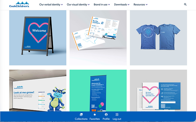
The inspiration gallery was the emotional heart of Brand Central — a living showcase of real projects, created by real people across Cook Children's, all demonstrating what the brand looks like when it's working. Welcome signs. Infographics. Apparel. Patient education. Mental health campaigns. Crucially, the people behind each piece were recognized by name.
The Prosper new mover welcome box — featured in the gallery — was recognized by the Fort Worth American Advertising Federation with ADDY awards in three design categories. Brand Central was the system that made work like this possible, and the place that celebrated it when it succeeded.
Brand Central turned brand governance from a cost center into a culture asset. By teaching people the difference between Big B and little b — and giving them the tools to live both — the team built something rare in health care: an organization that understood its brand deeply enough to protect it from the inside out. Usage analytics gave the team, for the first time, the data to prove it was working. And when the work won ADDY awards, Brand Central was there to celebrate it.


